Screen printers call it different things. Underbase, base, underlay, base layer, an extra layer, and I’m sure other things. It all stems from the same thing. Screen printing ink isn’t always 100% opaque, and it needs a layer underneath it to keep the prints vibrant. If there is white in the design, some may think that you can just use that white as the underbase, but in reality, the “base” white, and the top white (sometimes called “bump white”), need to be done at different points in the printing process.

Let’s Break It Down:
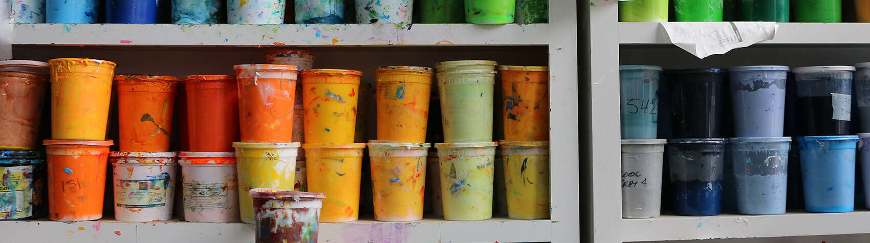
For a white and yellow print on a black shirt,
there will be 3 screens, and it will be charged as three colors.
First, there would be a layer of white underneath everything that is printed on the shirt. This is going to be the layer that the final print sits on, and none of this print will be visible if done right. It will be used like a primer, if you’ve ever painted model cars or painted a room, you may have used primer before. If your print looks uneven in the end, it may be your base layer.


Next up, yellow. This is going to be pretty straight forward. The only thing you want to look out for is the underbase peeking out where it shouldn’t. Sometimes people will “choke” the underbase or bring in the edges. The amount of choke is really going to depend on your screen tolerances.
Done, right? Wrong! You may think that the original white that you laid down would be good enough. It will be visible, but it won’t be bright or opaque. Also, the screen for the yellow will have pushed it deeper into the fabric. Instead of leaving it as is, we are going to use it as our primer for the visible white, or as I’ve always called it, the “bump” white. This is the third and final screen in this example, and will just be the visible white, right on top of the underbase that isn’t already covered by our yellow screen.
This would leave you with a nice white and yellow print on a colored shirt.
On a white shirt, or if you wanted the shirt fibers to show through, you won’t need an underbase.
This is what we call a vintage print – the print will look faded, and less opaque on a colored shirt.